(One of my favorite travel bloggers, Jen at Jetsetter’s Homestead, asked me to do a guest post on her blog last week. I wanted to share it with you as well, and Jen was gracious enough to let me use her photos here to illustrate the tips!)
I’ve invested a lot of time (and even more money) honing my craft and have learned a thing or two in the process. I thought this would be a great time to share some general photography tips with you and Jen has been gracious enough to let me critique some of her pictures to illustrate these concepts.
Which camera is best?
Before all that though, I want to answer the question: which camera is best?
On June 15, 1999, Nikon introduced the D1, the world’s first consumer-grade digital SLR camera. It featured a 2.7 megapixel sensor and cost north of $6,000. Today most everyone reading this post has a smartphone with a camera on it. The iPhone 6, as an example, comes with an 8 megapixel camera. So, before you ever think that you need to buy a new camera in order to take great pictures, remember that you probably have 3 times the megapixels/resolution of something people were lining up to pay $6000 for!
The best camera in the world is the one you have with you, period.
I won’t get into a great amount of detail about things like aperture, exposure, and ISO. What’s way more important to me are composition and subject placement, so that’s what we’re going to focus (pun intended) on.
So here we go, my tips on taking great travel photos, even with your smartphone!
- Before taking a picture, slow down and ask yourself “what am I taking a picture of and why?” Try and fill the frame with your answer.
- Have something for the viewer to look at in the foreground, middle ground, and background of the picture and make sure they’re not blocking each other
- If you’re taking pictures of people, a) make sure you have their permission and b) make absolutely sure you get their eyes in the picture
Let’s take a look at some of Jen’s pictures (shot with her trusty iPhone) and I’ll give you my thoughts. Critiquing photos is inherently subjective so I’ll caveat myself by saying if you love a picture, love it! I’m not the end-all be-all about this stuff and if you look through my pictures I’ve broken those three rules way more than I’ve followed them.
“What am I taking a picture of and why?”
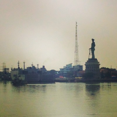
Let’s take a look at the below

There are quite a few visual elements to this picture: the statue, the radio tower, and the boat on the left. The problem is there’s not a coherent subject of the picture. If I was describing this picture I’d have to say “there are a lot of things next to the water on a cloudy/muggy day”. Usually if you give people too many options they’ll choose none of them and go on to the next picture. Now, does that mean you shouldn’t take pictures with many different things in it? Of course not. Let’s take a look at this next picture to understand what I mean.

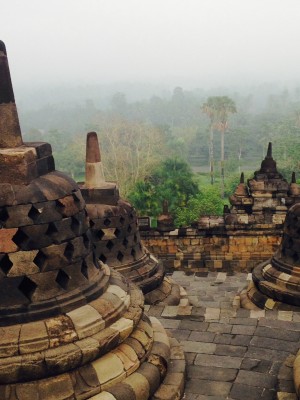
I love this picture! It’s visually stimulating and is a great example of tip #1. I don’t even know what to call those things but let’s describe that picture in the same way as the first one: “The large ornamental structures are framed by the lush vegetation underneath a foggy and muggy sky.” That’s not just me coming up with a more interesting wording, it’s what the picture says to me. When you answer the “what am I taking a picture of and why?” question you should be as detailed as possible. If I was in Jen’s shoes for picture 2 I’d say to myself “I want to have these structures on one side of the picture so I can get the trees and vegetation to fill the negative space. I think the clouds add to the mood so I want to have quite a bit of sky in the picture too”. If you answer that question well you’ll know exactly where to point your camera and can proof it as you go.
Have something in the fore-, middle-, and background
Your pictures need to have depth, period. If you want to draw a viewer into your photo there needs to be something they feel like they could almost touch, something they could walk to, and something that seems far away. This organizes things for the viewer and makes it so you can actually predict the path of their eye as they see your picture, which is very powerful.
Let’s take a look at this picture, which is very common of pictures taken from cruises:

One immediate thing jumps out at me: the horizon isn’t level. While easily fixed in editing software, always strive to keep straight lines horizontal or vertical, unless you’re intentionally distorting something for effect. Another thing: the horizon is right in the middle of the picture. A common photography rule is the Rule of Thirds. For shots like this, when framing the picture, if the sky is more interesting move the horizon to the bottom third, if the sky isn’t as interesting move the horizon to the upper third. It’s just more visually interesting.
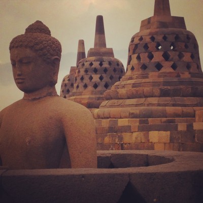
The main thing though is that there isn’t anything that grabs my attention. The colors are very nice but it’s all background. If you’re on a cruise ship balcony and are tempted to take a picture like this, maybe put a cocktail on a table on the balcony or have someone stand next to the railing to provide a visual element in the foreground. A background can be very powerful, but that power typically comes from things in the fore- or middle-ground.

Jen nailed it here. Your eyes, like mine, most likely went to the statue first, then the middle ornament thing on the right, then back to the distant one. This is an absolutely fantastic picture and illustrates how where you place your camera can add richness and depth to your photos.
It’s all in the eyes
I know I said this tip applies when you’re taking pictures of people, but the same is true of animals.

Look at this Komodo dragon. Now imagine it was facing away from the camera. It’d completely change the feel wouldn’t it? It’s all in the eyes. Eyes are expression, eyes tell a story, eyes invite someone to sit and ponder. Do a Google Image Search for “Afghan girl”, widely proclaimed to be one of the most impactful images ever taken. Now imagine her eyes are closed. Completely different picture.
Which of the girls in the picture below got your attention first? Be honest.

Front row on the right, am I right? Even if you’re tempted to say no just because you’re like that, odds are she’s the one your eyes went to. Eyes attract eyes. There are great elements in this picture, but if there are people in a picture, we’ll by default look straight for the eyes.
SURPRISE 4TH TIP: Crouch down or stand higher!
Let’s go back to the Komodo dragon picture.

It’s a great picture that is taken from eye level of the photographer. This picture could’ve been even better if taken from eye level of the subject. Don’t be afraid to crouch down to get on something’s level, it could completely change the picture for the better. Shoot low, shoot high, shoot off to the side, try many different ways of taking the picture!
(note: I’ve since been informed it’s never a good idea to get down to eye level with a Komodo dragon, so imagine that’s a picture of a really docile cat instead, the lesson will be less potentially fatal that way)
Whew, that was a lot! I hope you found a few tips that you can take with you on your next trip, and thanks Jen for hosting me!
(note: if you’d like to see how I post-process some of my pictures, taken with my Sony a7 in RAW format, in Adobe Lightroom, I’ve put together a youtube video discussing my normal workflow for most of my landscapes and cityscapes at https://www.youtube.com/watch?v=JKta-02APl8…editing definitely adds some complexity to the process!)


Trackbacks/Pingbacks