[note: clicking some of the links in this post may take you to affiliate partners who pay a commission should you make a subsequent purchase, thanks for your support!]
Some weeks ago I posted an article about the Fuji XF10, calling it “a small camera I want that’s NOT a Sony!”
The premise was twofold:
- I get asked pretty frequently some version of “Hey Andy, we really think you’re wonderful at everything you do (ok I may have made up that part), we’re taking a special trip to [destination] soon and want a camera that’s a bit nicer than our smartphone, is there anything you’d recommend?”
- Sometimes when I’m feeling lazy I don’t like taking all of my gear on photowalks and would love something that I could throw in my pocket that’s fairly cheap but takes great pictures
Enter the Fuji XF10, in black or in stylish champagne gold.
The unique Fuji XF10
The XF10 is uniquely constructed for the consumer who is used to shooting with a smartphone. It has a fixed focal length equivalent of 28mm, the same as most smartphones. But whereas most smartphones have a fixed aperture, a tiny sensor, and around 12 megapixels the XF10 sports the following:
- 3-inch screen which functions as viewfinder and touchscreen
- 24-megapixel APS-C sensor
- Maximum aperture of f2.8, adjustable
- Fuji JPEG modes, for which Fuji are well-known
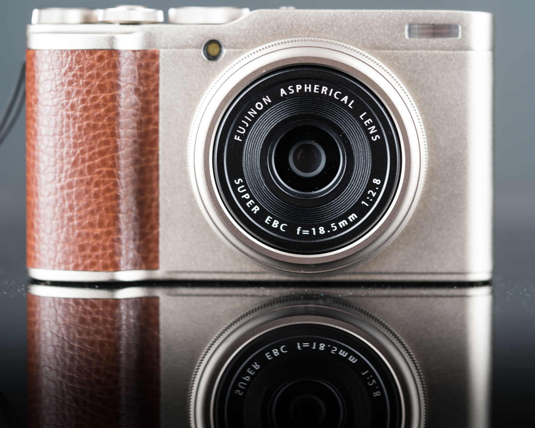
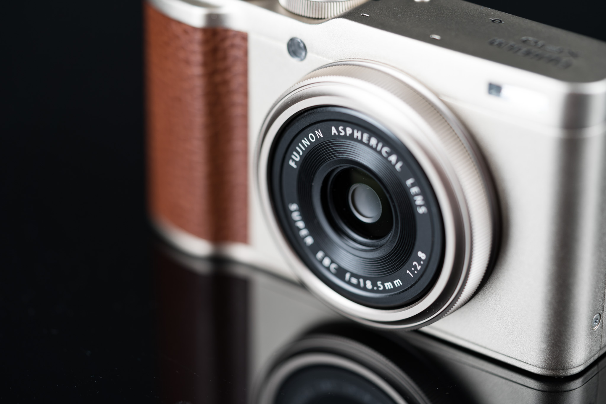
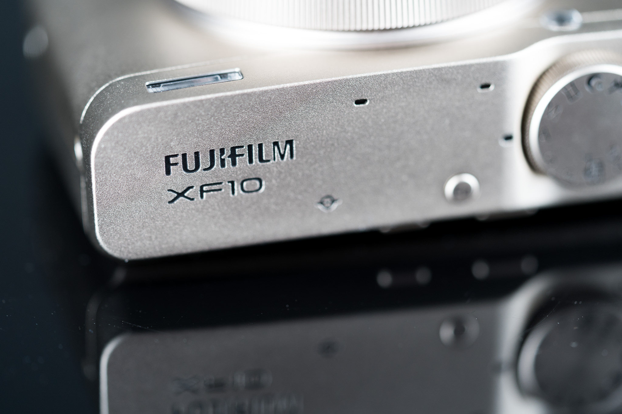
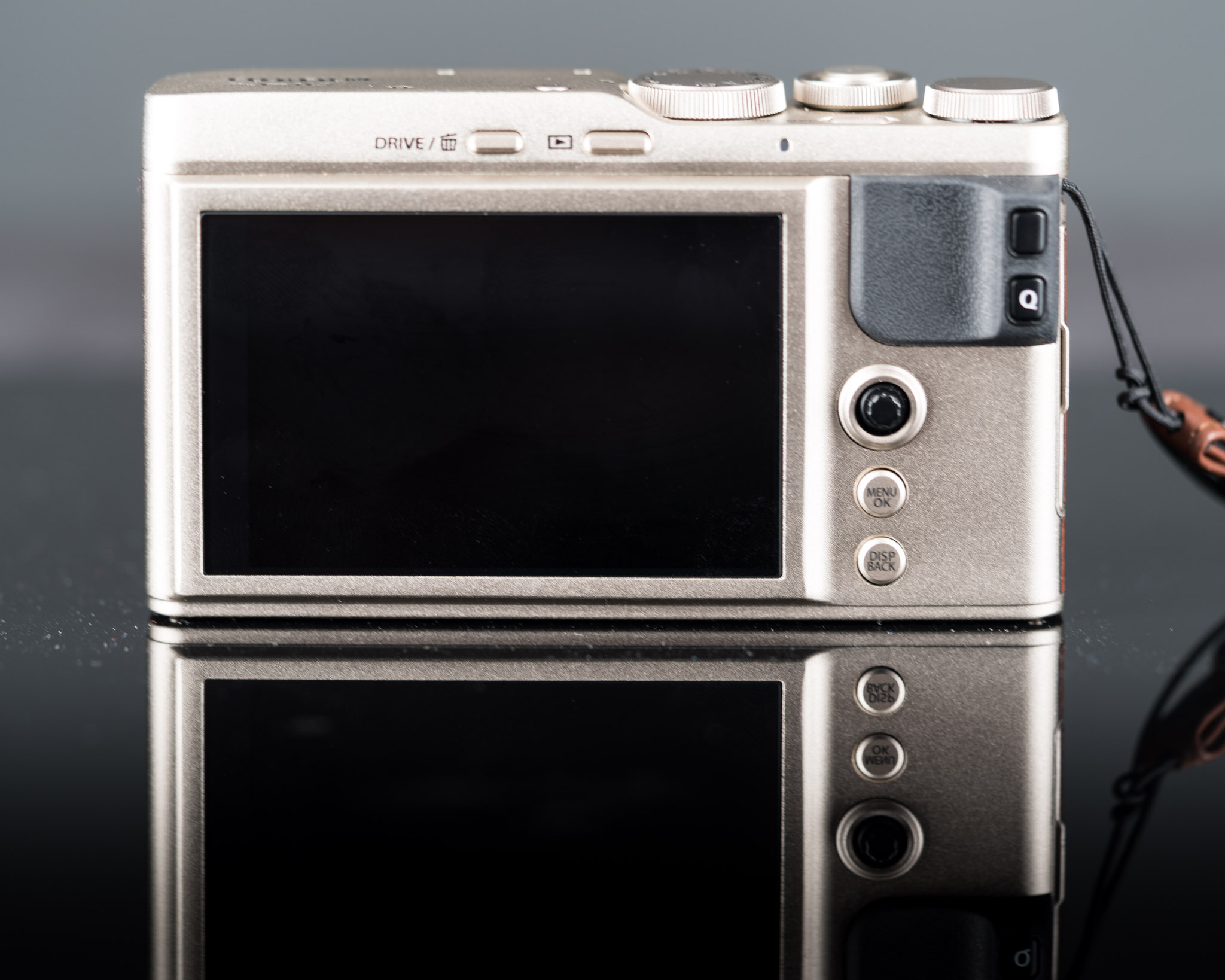
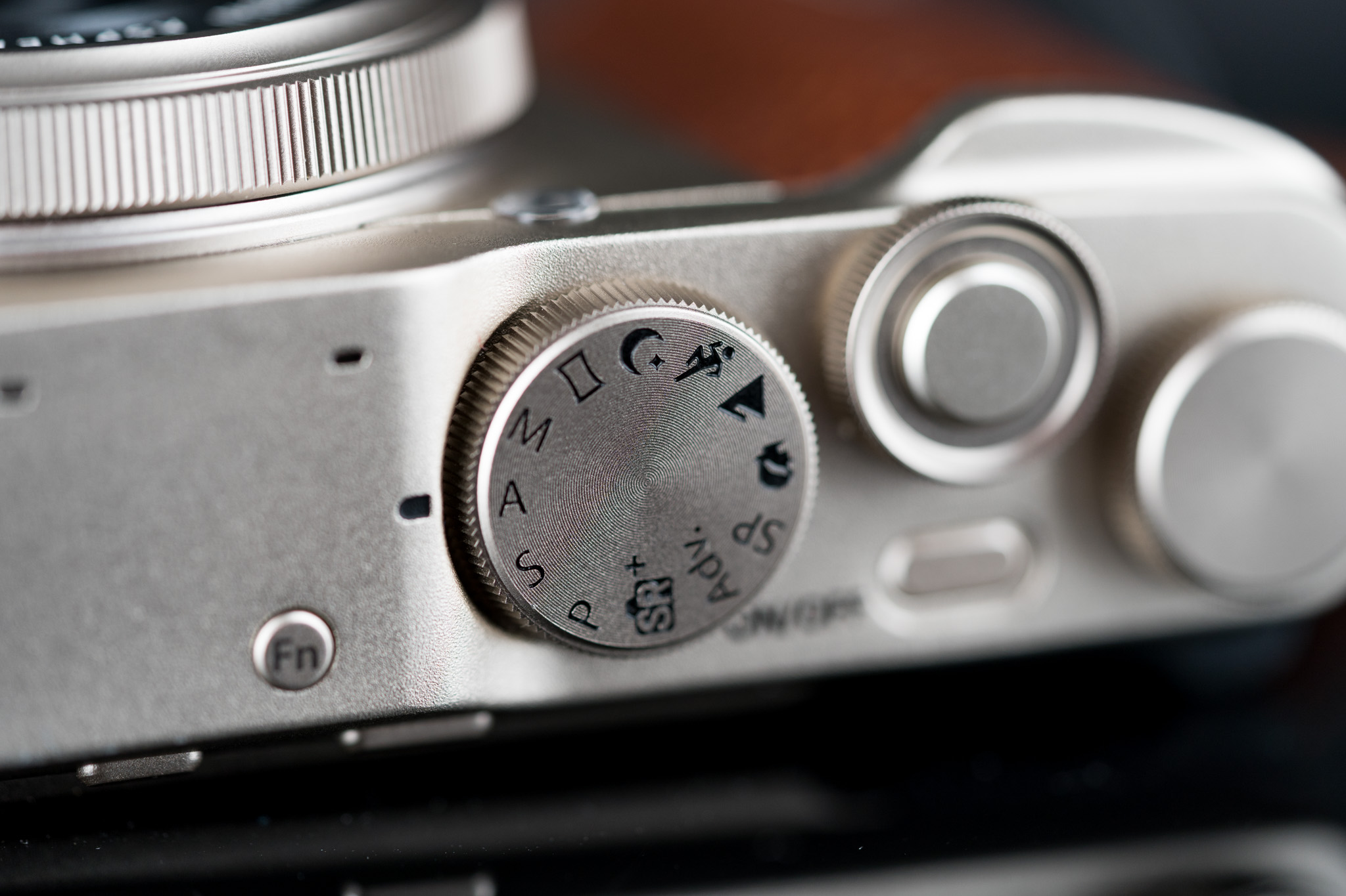
I got my hands on one to put through a little test. First, let’s take a look at the beautiful design. (These are my images, not Fuji stock photos)
It’s well constructed and feels solid for the price. There’s one ENORMOUS design flaw that I’ll get into later, but first I’ll show you the mode dial and the back of the camera, which is where your controller options will be.
How easy was it to set up?
I’ve used a Fuji before so I was somewhat familiar with the menu system. I could understand how some could find it confusing though. Once you have it set up the way you want, though, it’s about as easy as could be to use: turn it on, frame your shot, and shoot. Autofocus is quick and you can use the touchscreen on the back of the camera to focus on a specific spot.
There are quite a few different styles to shoot in JPEG: black and white, Fuji’s legendary Velvia, and more while at the same time there are in-camera HDR, in-camera double exposure, and dynamic range optimization modes that make it really easy to get the shot you’re looking for. After the shot you can use Fuji’s app to transfer the pictures to your phone to share all over everyone’s socials.
Ok so what unnecessarily complex test did you come up with to test the Fuji XF10?
I was out at the Trinity River with some friends taking some pictures of Dallas with my Sony a7rIII and had the XF10 with me as well. I got the 24-70 G Master on my Sony to about 28mm and then took a picture with the XF10 on the same tripod. I shot in RAW on both cameras and, well, unsurprisingly I was able to get them looking almost exactly the same, albeit the a7rIII having more megapixels.
But then I realized that’s a bit of a ridiculous comparison. If someone is going to get the XF10 to take on a special family vacation they’re probably not going to be shooting in RAW and editing in Lightroom or anything like that, they just want to pick a mode and snap away.
So let’s pit the Fuji XF10 against my iPhone X
So here’s what I did: I put the XF10 in landscape photography “mode”, switched to JPEG, and went for a photowalk around my neighborhood. Whenever I stopped to take a picture with the Fuji I would take the same picture with my iPhone X. I wasn’t scientifically precise but tried to get as close as I could.
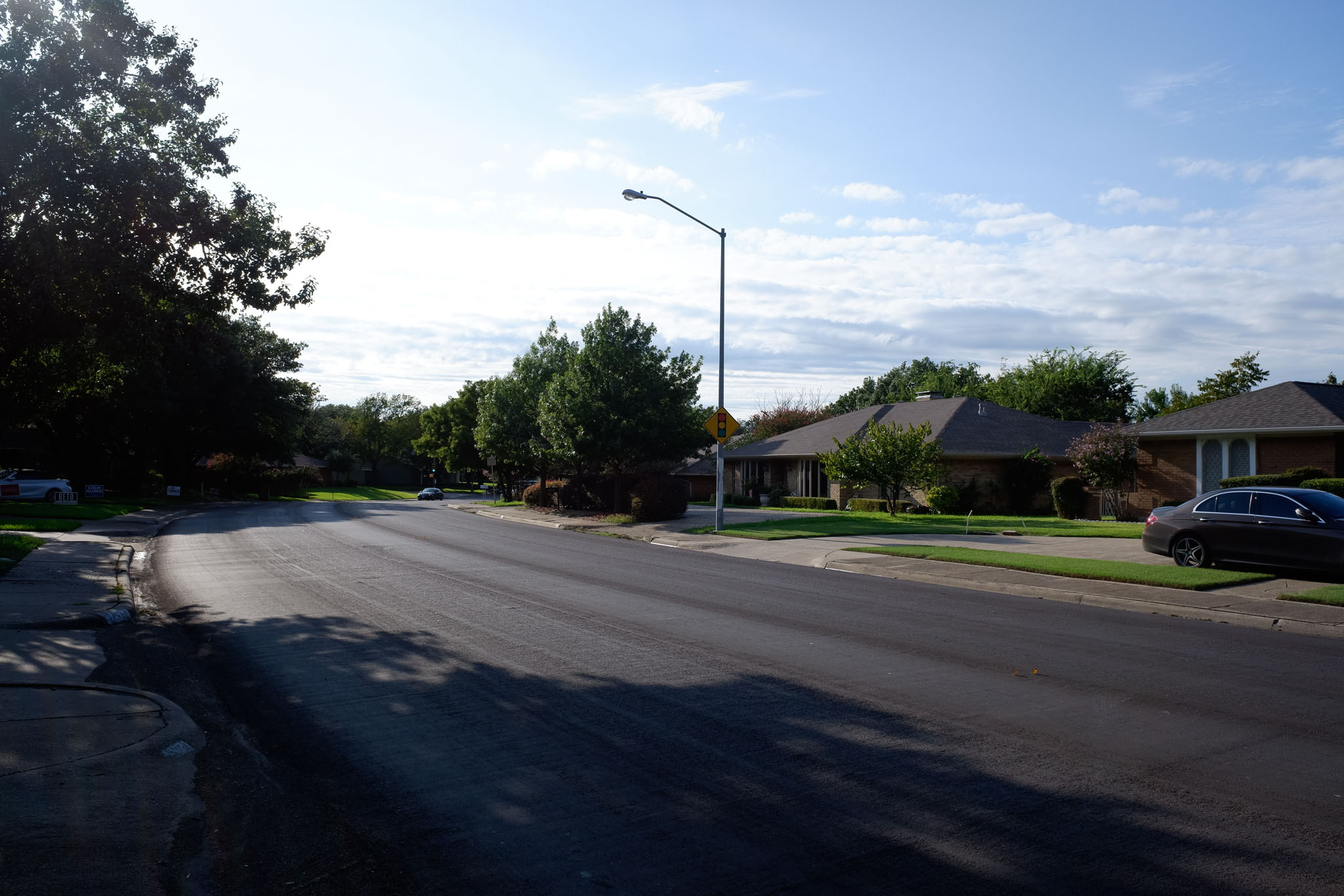
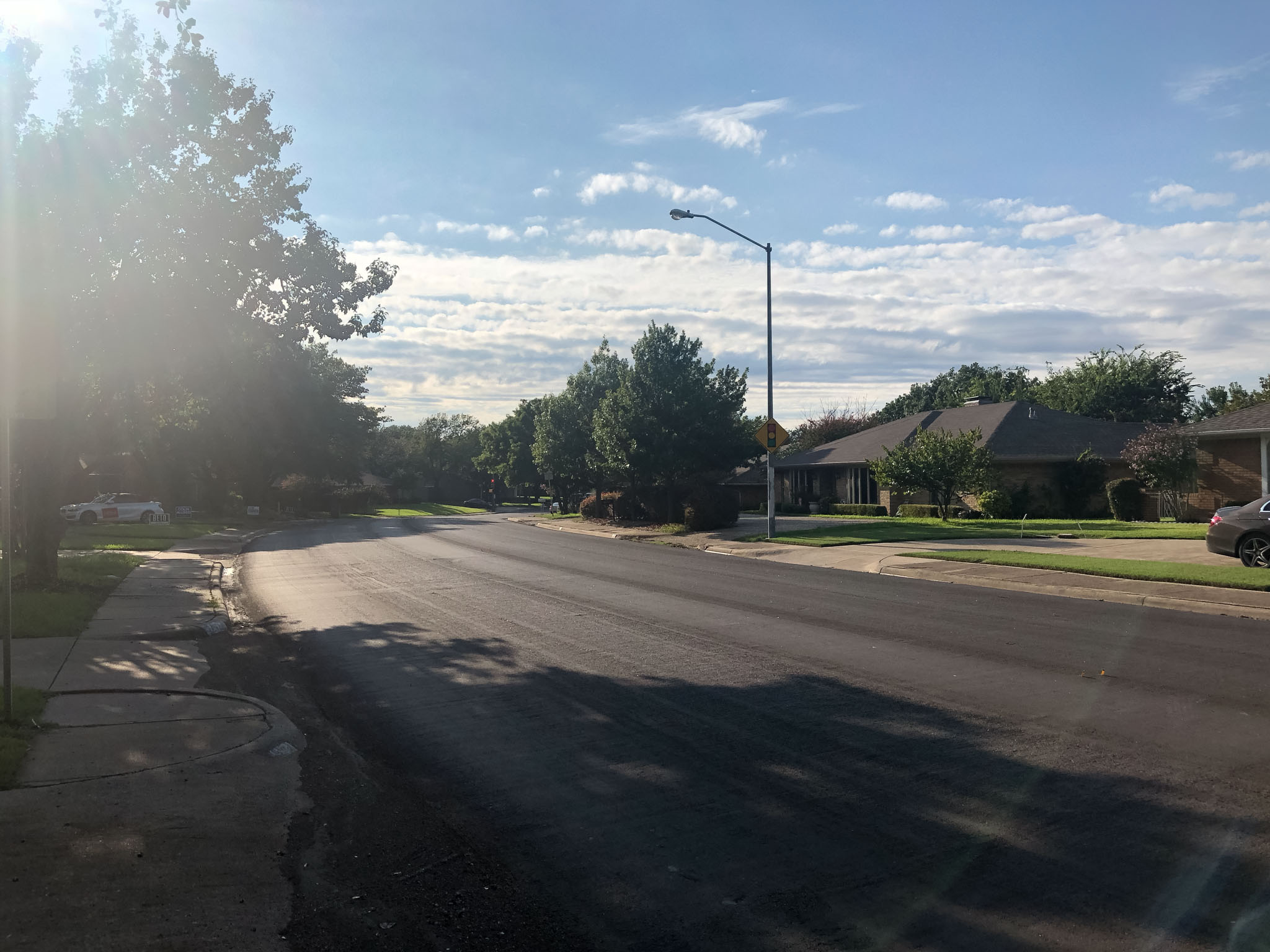
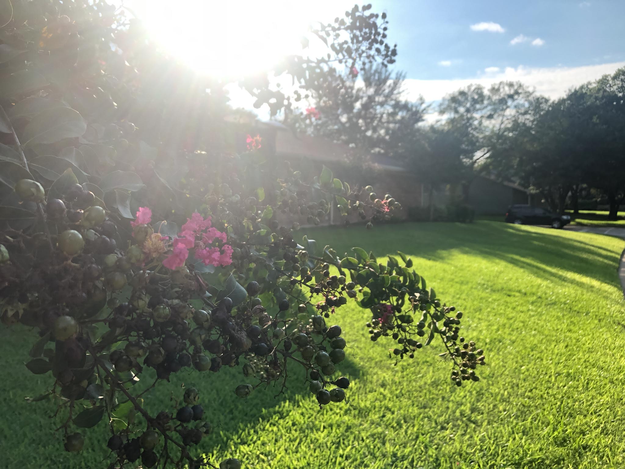
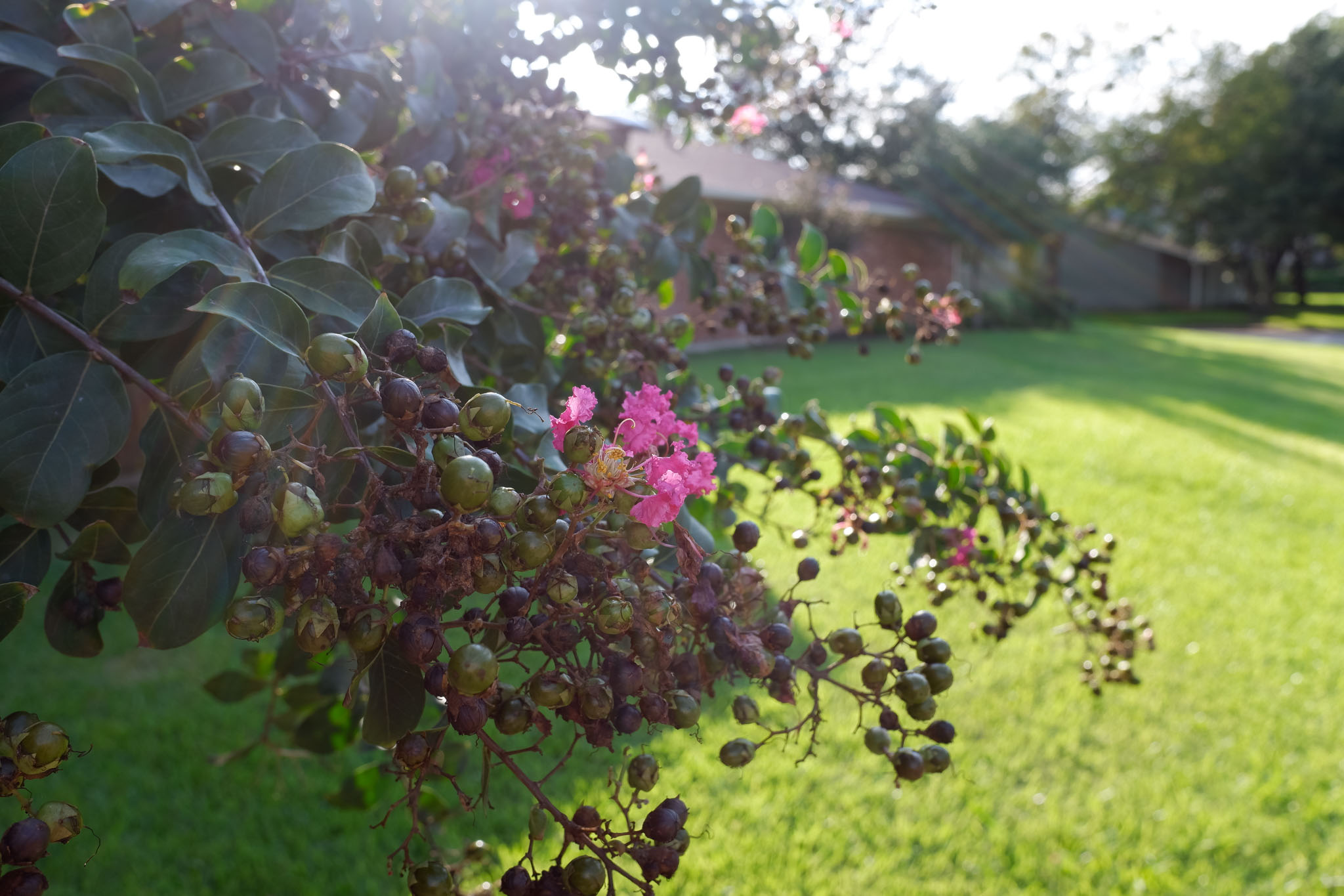
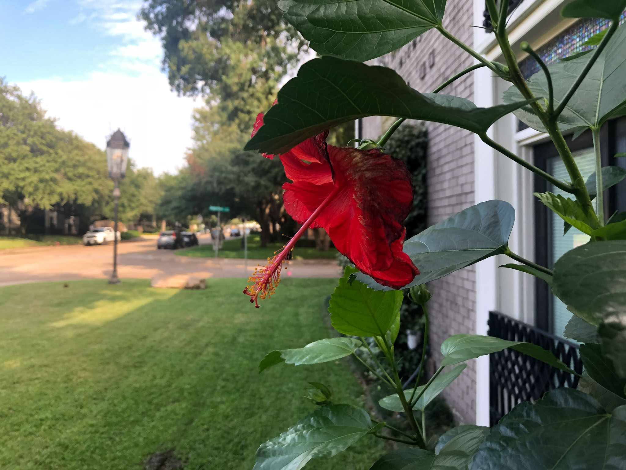
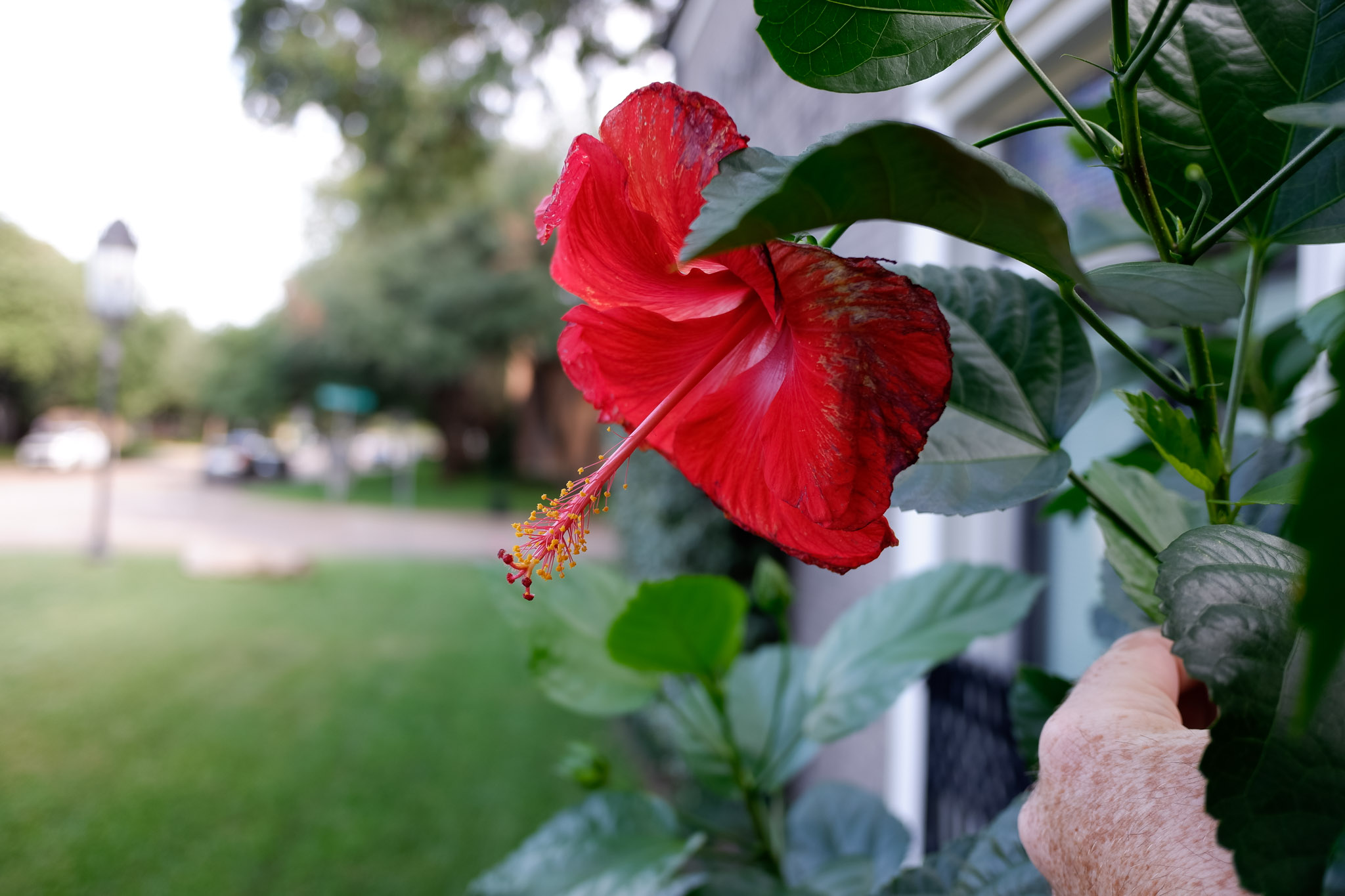
So here we go, let’s take a look at the first two pictures. Both are straight out of camera with absolutely no editing performed, the only thing I did was make the pictures the same dimensions (2048 pixels on the long edge), since that’s how they’d probably be posted to social media anyway.
First off, this one isn’t really a fair contest since I accidentally was shooting the XF10 in aperture priority mode at f2.8. The iPhone has more in focus, but what I want you to pay attention to here is the color rendition. The XF10 is a bit crisper but the colors are a bit softer. I feel like the iPhone decided on its own to raise the exposure a bit and apply an absolute ton of what Lightroom would call Clarity, whereas the Fuji kind of accepted the scene as it was without trying to apply too much logic to it.
MY OPINION: Draw, since I didn’t have the XF10 in the appropriate mode.
Ok so here the Fuji was in Landscape Mode so it was shooting at roughly the same aperture as the iPhone. And this picture illustrates one of the flaws I’ve found in the iPhone’s algorithm: it really doesn’t want any blown out parts of the image. The Fuji again just accepts the scene for what it is and you see very gradual flow from the blue sky on the right to the bright white of the afternoon sun on the top left.
The iPhone, on the other hand, really bakes in a lot of editing into the picture. It looks like it decided to do some sort of HDR blending on its own to keep the sky as blue as possible and show some detail in the shadows. My personal opinion is that the sky really lost the gradiation in light from bright to not bright, it’s just BRIGHT around the sun and then EVENLY NOT BRIGHT for the rest of the image.
My opinion: XF10
The iPhone really doesn’t handle the sun in the frame well. A more well-rounded test probably wouldn’t have included two shots with the sun in the frame but oh well. The iPhone “algorithm’d” this image again. I ended up with a hugely bright sun and then an unnaturally take sky very close to it. There’s a brutally bad aqua color shift between the bright sun and the blue sky also. The detail is lost in the plant in the foreground due to the glow from the sun.
The XF10 probably got off easy here since the sun wasn’t as prominent in the picture as it was for the iPhone. That said, it didn’t suffer from the “glow” of the sun as much as the iPhone did and it didn’t try to overcompensate for anything either, if the highlights were getting too crazy after a certain point the XF10 let them go crazy with much better transition from dark to bright.
My opinion: XF10. This was a super super hard shot for the iPhone to process, my Sony probably would’ve struggled even, due to the dynamic range present in the scene.
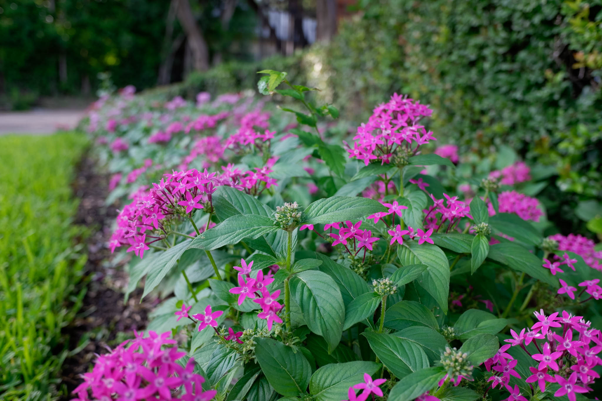
The Fuji was in aperture priority again on this one but I was super impressed with how the iPhone X shot this one. The Fuji’s colors are a little more organic to me, but there’s nothing at all wrong with the iPhone’s shot.
My opinion: draw, surprisingly, although the iPhone was still playing HDR, which is why you see color in the sky in the iPhone shot and it’s blown out for the XF10.
The iPhone handled the dynamic range of the situation here, the colors are even but again the thing for me is the gradiation between colors and luminance: the iPhone seems to make the decision that color and brightness should be even until the last possible second and then change all of a sudden.
My opinion: XF10, although it was close. For me the brightness of an image plays just as much a role in separation of subject from background as anything else and I think the iPhone’s algorithm tries to get everything absolutely perfect to the point that it’s almost robotic while the XF10 allows for “pleasant imperfection” if you will.
Ok neither one of these images are very good if I’m really honest, I just wanted to put both cameras in a selfie situation. Unintentionally the sun was in the shot again and you can see the crazy colors that the iPhone came up with trying to make everything perfect while the XF10 just said “meh whatever sun” and blew everything out.
My opinion: XF10, even though I hate picking a winner here, a better test would’ve been a random family or something like that to more accurately represent a tourist situation.
Before announcing a winner, let’s talk about two major design flaws in the Fuji XF10
Number one: the screen doesn’t tilt, it’s just fixed in place. I get it, that probably costs money but Fuji seriously every camera has that now. If you put a 180-degree tilting screen, like Sony’s RX100 III-VI, it’d be incredible for selfie situations, but as it is it’s an annoying miss.
Number two: the lens cap. Part of the lens mechanism sits behind the front glass element, which is nice because it’ll prevent dust from ever getting too far into the camera mechanism. The bad part, though is there’s a black plastic lens cap that you have to fit onto the outer layer of glass. It’s annoying and protrudes a bit too far from the camera, jeopardizing the pocketability of the camera.
Ok, now that we’ve done a somewhat random test and talked about the flaws, the winner is….
Ok there’s not really a winner here. You’re not going to NOT bring your phone on a trip in lieu of a camera, so really the question here should be “is it worth paying $500 to bring this AND your phone?”
For me the answer is: yes, but. There’s a huge reason for this: the Sony RX100 III. The Fuji is reasonable in price compared to other cameras but $500 is a lot of money. I’m not sure I could sit here and tell you to buy the XF10 instead of spending $150 more and getting a Sony RX100 III for $650. The RX 100 III is an all-around more capable camera and has a 180-degree flippy screen. The upcoming Ricoh GR III will be a monster in this area as well.
The Fuji XF10 is the perfect camera for people who want to see something pretty, whip out a camera, point, shoot, and share. It doesn’t zoom, there aren’t tons of controls, so it’s a very one-click experience. It’s pure simplicity backed by a really powerful sensor. If that’s attractive to you, by all means consider the Fuji XF10. It will simply deliver enormous quality and be a relative care-free shooting experience. If the lens cap was designed differently and it had a selfie-facing screen it would be an absolute no-brainer, that’s for sure.
Man, I really hate ending on a caveat but I think that’s where we were destined to end up anyway. It’s a bit of a tweener situation. I wonder if I was the best person to do this test also, since I’m so used to tinkering with my images after the fact anyway.
Anyhoo, hope you enjoyed the sample images and the comparison! Are you interested in the XF10? How did you find this test? Let me know in the comments below!








Hi Andy. Thanks for your review and photos.
My backup or second camera the one that’s always with me is a SONY-RX100-III.
My first and preferred camera is a Fuji filmed X100F.
When I learned about the XF10 I said boy this is the small camera I need instead of the RX100 III.
Why? The Sony is an excellent camera!
Well, mainly because the XF10 is a Fujifilm camera with menus, film sims, etc that I’m used to with the X100F.
Many times I see a photo, take the Sony and have trouble to remember how to set it properly for the photo I pretend to capture (loosing it most of the times).
Now besides menu problem (for me), the Sony has an EVF, an ND filter, a tilting LCD (shooting from the floor, above my head, from my hip), while the Fuji doesn’t have that.
OK. I’m facing an unexpected situation. And I have not a clear decission.
As you said the RX100 III is an excellent camera, and… I already have it!
Why not mention the XF10’s leaf shutter & high speed flash capabilities? Or post a few low light shots where the aps-c sensor would crush the iphone?
I have the iphone XS & for all portraits it applies heavy handed smoothing to faces, whereas the samples I’ve seen of XF10 people shots are amazing with sharpness, detail & skin color rendering.
XF10 also creates appealing, real bokeh at 2.8 aperture vs computational bokeh in iphone.
I’m considering XF10 for people shots, higher dynamic range, high speed fill flash, film simulations, manual controls in a small, light package.
Comparing a 1 inch second to an APS-C is like comparing a pug and a bulldog. Sure, RX has more features, etc., but the XF10 is designed for low light photos, possibly some bokeh and is super light to carry around.
Loved this comparison.
Photographers seem to forget that simple cameras are made for ordinary people, who have grown up on an iphone diet.
Hence the output of any simple camera has to convincingly beat the iphone first
Forcing myself to look at it from a typical consumer perspective was challenging at first but was pretty enjoyable, glad you enjoyed it!
I like this write-up, but I think your basic premise is flawed. This is not a casual snapshot machine (though it would excel at that), but a serious photographic tool for those who print photos. Of course, one can do with a camera like this as they see fit, but I’m betting 99 of 100 owners fit the enthusiast profile.
Camera phones are so good, if you’re not printing, why do you need a camera like this? It’s even the same focal length.
In my mind this is a perfect part of a two-camera travel setup, one wide and one tight. I used a Nikon Coolpix A and a M43 camera in this manner on a trip this summer and it was perfect. Both cameras sport 16 megapixels and I have been making 12×16 prints from them. Always shooting in RAW also, as I suspect almost everyone who buys an XF10 will.
That’s a fair critique. I don’t typically like the pictures that come out of my iPhone as they feel too algorithmic, so having a similarly sized option with a much larger sensor, even for shooting JPG, seemed like a really good option for the price. I think if Fuji can price it closer to $400 it’ll be even better, $500 seems a bit much for it.
I fully agree. I’m a compact camera shooter. I own a Fujifilm X100F which I take with me when I go out to make photos. Wonderful.
The rest of the time I always have with me the pocketable Sony rx100 iii, which I’m planning to replace with the fuji xf10, same system, fuji film sims, and… A APS-C sensor with 24 Mp. That’s it!
If you were familiar with Fujifilm cameras, you would know that that Fujifilm JPEGs are fantastic out of the camera. I have an XT-10 and XT-4, I never shoot RAW unless I have a specific reason to do so.
What a moronic reveiw! All this reading and in the end, you cannot decide. Why? Because you are paid by both. What a waste of time….. and Sony???? give us a break!
I’m not paid by any of the brands mentioned in the article. Thanks for reading!
I’ve finally sold my Sony rx100 iii and bought the Fujifilm xf10.
After 5 months of use all I can say is that I’m glad to have done so. Not because the Sony is not good but because the Fuji is better (for me).
I fully agree with the comment of Emptyspaces. (see above).
The xf10 is a serious camera that can fulfill the requirements of an enthusiast photographer, assuming the acceptance of a fixed 28mm equivalent lens.
Nowadays I take my X100F when I go out with the purpose of making photos, while the XF10 is always in my pocket or in my bag.
And I must say that, even without EVF, hot shoe, tilting screen, ND filter and zoom, I still consider the XF10 a full fledged camera, capable to deliver high quality images, even in low light.
I bought mine from a guy that thinks similar to Andy. It was 3 months old and I paid €340 !
Glad you’re enjoying it!
A better camera to compare to the Sony RX100iii is any of Fujifilm’s XA series. They all have the flip up screen. The Fujifilm X-A7 which has a totally flipable screen like most Canon’s have. Considering that the X-A series have interchangeable lens, with the kit lens being a very capable 15-45mm zoom lens. A far more capable camera than the Sony. Mainly because of the larger sensor. If one is going to purchase a camera then one should get the best they can for a reasonable budget. The Sony RX100iii and the Fujifilm X-A7 are both within $100 of each other.
As for Apple X, etc., the Google Pixels still have the best cameras on a smart phone. Apple is still playing catchup.