United has been teasing the release of its new livery for a few months now. Despite numerous leaks and rumors about it, I really thought they were going to hold on to the secret until it was revealed today in Chicago. Nevertheless, the internet internetted and someone posted the full, unfettered United livery yesterday evening.
United didn’t really have a choice at that point so they decided to release a video unveiling their new paint scheme.
Our next livery has been cleared for takeoff. Stay tuned right here for more from our celebration in Chicago tomorrow! pic.twitter.com/n4CJrAJERG
— United Airlines (@united) April 24, 2019
Let’s talk about airline liveries for a second
Most airline liveries are painfully corporate these days. When you look at all of the recent ones that have been announced they’re all basically copying Qantas: white body and solid color tail with logo on it. And everyone is sticking to one color now too, which is a double bummer.
Why are so many liveries so boring? I mean it’s not really a shock I guess, no mainline carrier would want to risk their brand equity by doing something wrong, but I guess that’s my point: there’s more to a good livery than nothing being wrong with it. Low-cost carriers like Spirit, Frontier, Scoot, Froosh, Zwouwck, Jauntt, Grackle, or whatever the heck new ones are popping up these days etc etc, are notorious for daring liveries because, well, they need to be noticed. Bigger airlines usually play it safe but man it seems like they’re erring on the side of way too safe with the yawners we’ve seen from Alaska and Lufthansa
I’d love for airlines to show more personality. Which brings us to…
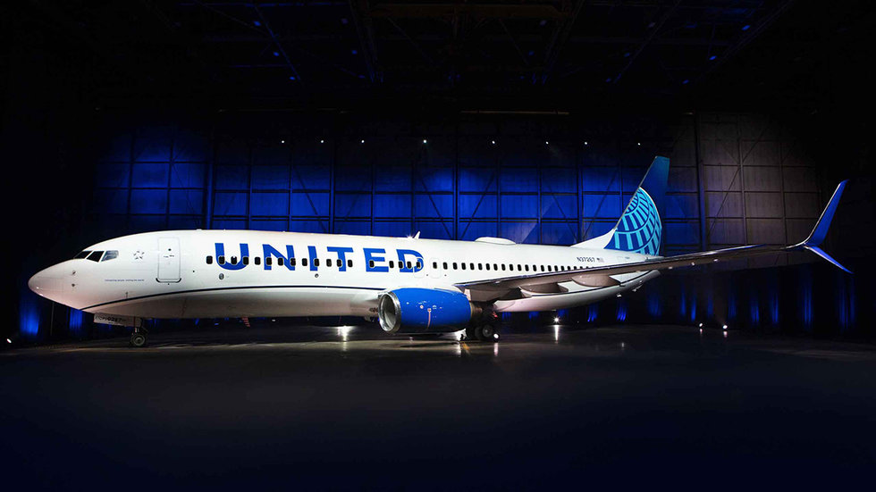
What I think of United’s new livery
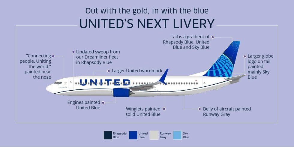
My thoughts? It’s a lot of blue. United has used Gershwin’s Rhapsody in Blue forever and, well, this new livery is basically that. The revised globe on the tail is a nice nod towards it’s Continental days. The United font on the side of the jet seems more prominent, which is nice, but that’s all pretty normal. Where I start to like the livery is the swooping line on the “belt line” of the jet. The line frames the text on the side of the jet well, and the gray color underneath is a nice offset in the same color palette. Looking at the plane from ground level the blue engine will break up this lower gray part. All in all it’s still very corporate but isn’t as boring as, say, Lufthansa’s boring new livery. I would’ve loved to see them incorporate some gold, just to get out of the One Color Besides White schemes so many airlines are doing these days, but oh well.
Ok, enough from me, what do you think? Tell me in the comments below!
This is the kind of innovation and forward thinking we need in the airlines!! Such a bold and daring move by United to set themselves apart from the rest of the pack…by sticking with the most common color scheme in corporate America (single color of blue)…
Wow, the video was really setting up for something massive and different…and I can barely tell the difference between the old livery. They should just start calling themselves Generic Airline.
I wish someone would post a picture of the old livery and the new side by side. All I can tell is they made a line curve. Seriously. This is not revolutionary. Or even big. Or really new.
Bring back the tulip! If they are really resistant, then have a small tulip by the front door on the outside. Air France had the flying shrimp before near the front.
It’s not terrible. I don’t hate it. I think it’s a nice Livery, but I wouldn’t have taken the gold out. The gold trim really stood out with the old/current livery. Also, it’s kind of a smack in the face to those who worked with Continental before the merger. As I said before, I don’t hate it, as it is a nice livery, just I would’ve put more thought into it if I were the designers.